10 Tips to Optimize Your WordPress Website for Mobile Users

With the growing demand and advancement of mobile technology, it has been observed that people spend most of their time on their mobile phones for different purposes. Be it browsing, reading news or doing online shopping, it is obvious that considering this platform has become a need of the hour for businesses who want to expand and grow in the future.
Also, mobile users now represent almost half of the internet traffic and take up most space in all search queries. Google also penalizes the website in search results if the website is not optimized for mobiles. It is vital to optimize WordPress website for mobile users to give a positive user experience and cater to your audience based on their search query. Besides, from a UX perspective, Google implements a major overhaul of search algorithms and rewards websites optimized for mobile users.
If you optimize WordPress website for mobile users, it will perform better in search engine results and also help capture a huge amount of traffic coming from mobile phones. You will not lose customers who are using mobile phones for doing research, shopping, getting information, etc. If you optimize WordPress website for mobile, it will help your website rank high and cater to your target audience, resulting in more sales and better visibility online.
10 Tips to Optimize Your WordPress Website for Mobile Users
- Use Responsive Themes
- Track Your Progress
- Consider Professional Assistance of Website Designers
- Select a Reliable Web Host
- Redesign Pop-ups
- Put Google’s Mobile-Friendly Test Tool to use
- Consider Image Optimization
- Make your WordPress Website Responsive
- Use Plugins for Easy Readability
- Web Caching
Let’s elaborate each point
1. Use Responsive Themes
The first obvious step to make your WordPress website responsive is to use a responsive WordPress theme. Using such a theme will help in making your website content adaptable to multiple screen sizes.
When you use a responsive theme, it eliminates the need to develop a custom mobile website apart from your traditional website. Using a responsive theme for your website will help display the content in an appealing manner to the users, immaterial of screen size. You can find several WordPress responsive themes in the theme directory of WordPress. These responsive themes are mobile-friendly and lightweight.
>>>Related Read: 5 Best WordPress Themes For 2023
2. Track Your Progress
After making all the efforts to make your WordPress website mobile-friendly, it is also essential to track its progress to know how your website performs.
You can use Google Analytics which helps you track mobile user visits separately from the desktop site with a feature termed segmenting. You can track how much is the traffic, its source and which pages are gaining more attention from your users.
3. Consider Professional Assistance of Website Designers
If you don’t know how to optimize WordPress website, you can consider the professional services of a web design agency and hire their team to do the job. The talented WordPress web designers have in-depth knowledge, hands-on experience and are aware of the latest design trends. They have the required tools and skillset to make your website mobile-friendly, efficient and visually appealing.
4. Select a Reliable Web Host
It is imperative to pick a best web hosting for your WordPress website. Further, choose a good plan that offers the required speed and resources you require to make your website perform the best.
Choosing a reliable web host can make a significant difference in determining your website performance. When it comes to making your website mobile-friendly, speed is the most critical factor to consider. Therefore, keeping this in mind, you should select a plan that ensures high performance and minimal downtime. The best option is to choose a VPS hosting plan as it is affordable and offers brilliant performance all the times.
5. Redesign Pop-ups
Even though pop-ups attract a lot of criticism from users, they remain vital and effective tools for capturing visitors’ attention. Creating a website with one or two pop-ups to increase conversions or pass on important information to users is not harmful.
On smaller devices like mobile phones, even small or medium-sized pop-ups can create disruption. Google has recently brought into action some pop-up penalties that harm the user experience. To avoid being penalized, follow below mentioned guidelines while configuring and redesigning pop-ups for your WordPress website.
- They should not be obstructive or disruptive
- They should have a decent size button that makes it easy to close
- Pop-ups with vital information are exempt
6. Put Google’s Mobile-Friendly Test Tool to use
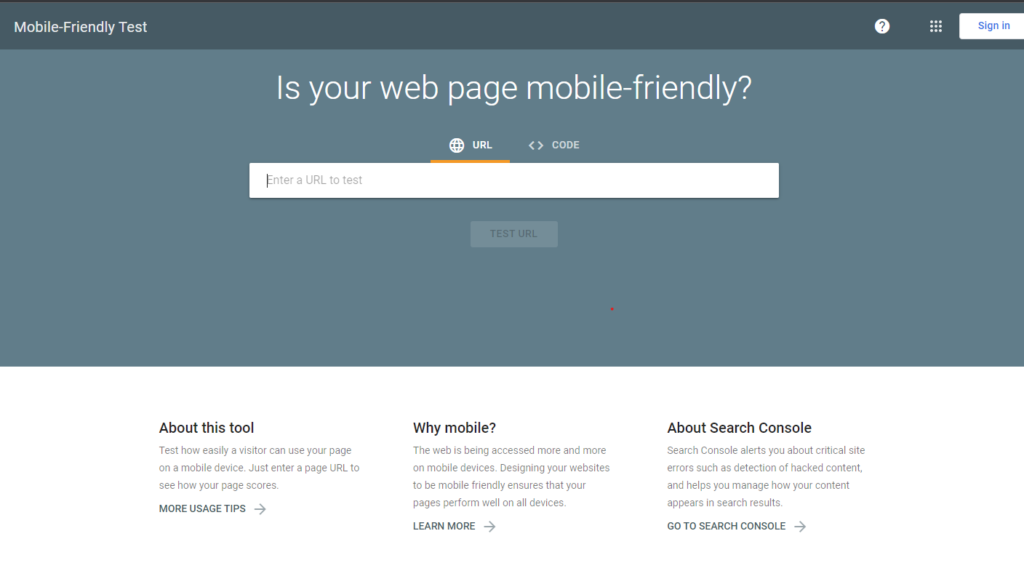
By using this tool, you can check whether your WordPress website is responsive to a mobile device or not. It will also let you know about other things needed to make your website adaptive to mobile devices.
Popular search engines are penalizing websites that are not mobile-friendly. Therefore, it is pivotal to check your WordPress website using this test tool to optimize it for mobile users. Using this tool, you can know what you are lacking on your website. It helps in quickly identifying issues that are affecting your website performance. You need to type in the URL of your website to do a quick assessment of your website’s mobile design.
7. Consider Image Optimization
If your website takes a long time to load, it can negatively impact users and lead to frustration. It can lead to an increased bounce rate which is often the result of the website taking too long to load. To be precise, half of your audience will not like to browse a website that doesn’t load in more than 3 seconds. Therefore, this time duration can have a positive or creative impact on your website in the eyes of your audience.
For this reason, it is recommended to consider image optimization to make your website load faster. You can use WordPress image optimizer plugins, which helps in image optimization for mobile users. If you don’t want to add anything new, you can use the TinyPNG service to shrink image sizes before uploading them to your server.
8. Make your WordPress Website Responsive
It is imperative to make your WordPress website responsive. It means that your website will be customized automatically on any device from which it is being viewed. Making your website responsive becomes much easier, especially if you use the WordPress platform for your website. To make your website responsive, you need to use a responsive WordPress theme that suits your website style.
9. Use Plugins for Easy Readability
The best thing about WordPress plugins is that they make the life of a website owner much easy. There are different plugins available in WordPress that serve various purposes, including making the website mobile-friendly. With the use of suitable plugins, you can make the content easily readable on your website without the need to zoom in to read a paragraph or line on a mobile phone.
10. Web Caching
Web caching means a version of your web page is copied and presented to the user at any time. Web pages are cached on the first visit of a user to a website’s page. When any new user tries to access that specific web page, the webserver will show the cached version of that page instead of showing the live version.
The objective of web caching is that it helps in improving your website performance and reduces the need for required back-end resources. Based on the caching solution decided by you, if you wish, you can also configure trigger-based events and custom intervals. Some of the commonly used names in caching are Memcached, Varnish and Squid. Not only this but there are a plethora of other solutions too offered in the market.
Final Thoughts
Having a responsive WordPress website can make a HUGE difference between your business acquiring new customers and clients or, in the worst-case scenario, sending them to your competitor’s websites. Therefore, you should make your website responsive.
In case if you don’t know how to optimize the website for mobile users, you do need to worry about that. you can approach a Custom WordPress development company to help you in the task.
I am Sr. WordPress Developer at Samarpan Infotech. I love to optimize code because I believe in "An average developer can write code that a computer can understand. But Passionate programmer write code that humans can understand".